XCL
Branding, Logo
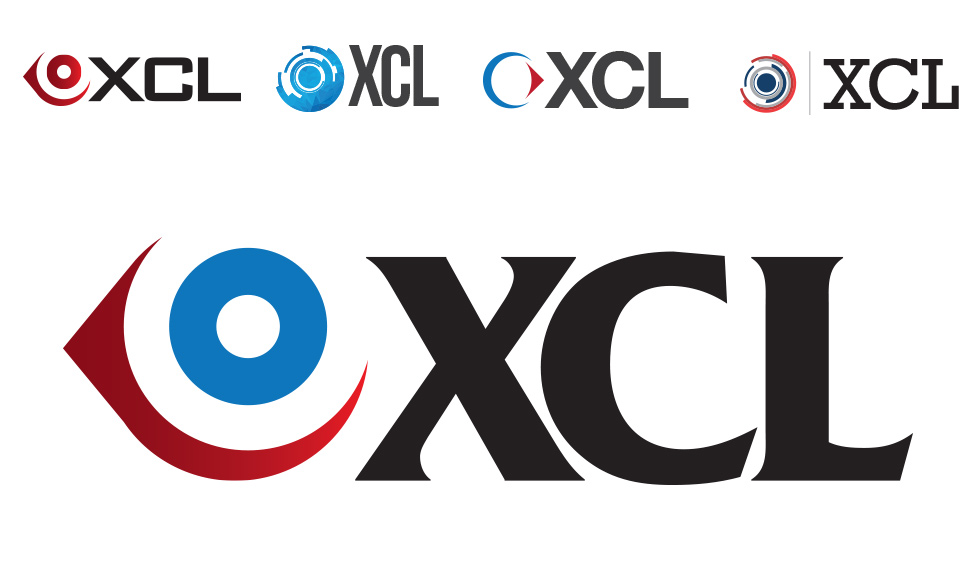
XCL is a company that develops surgical hand tools for eye surgeries. The client was looking for something modern and simple, so we came up with several ideas of icons that represent what they do. We wanted the eye to be the focal point of the logo, so took the shape of an eye and played with it until it looked clean and simple. After a few concepts they were set on one logo, but wanted different font variations and color.

